Incase Redesign
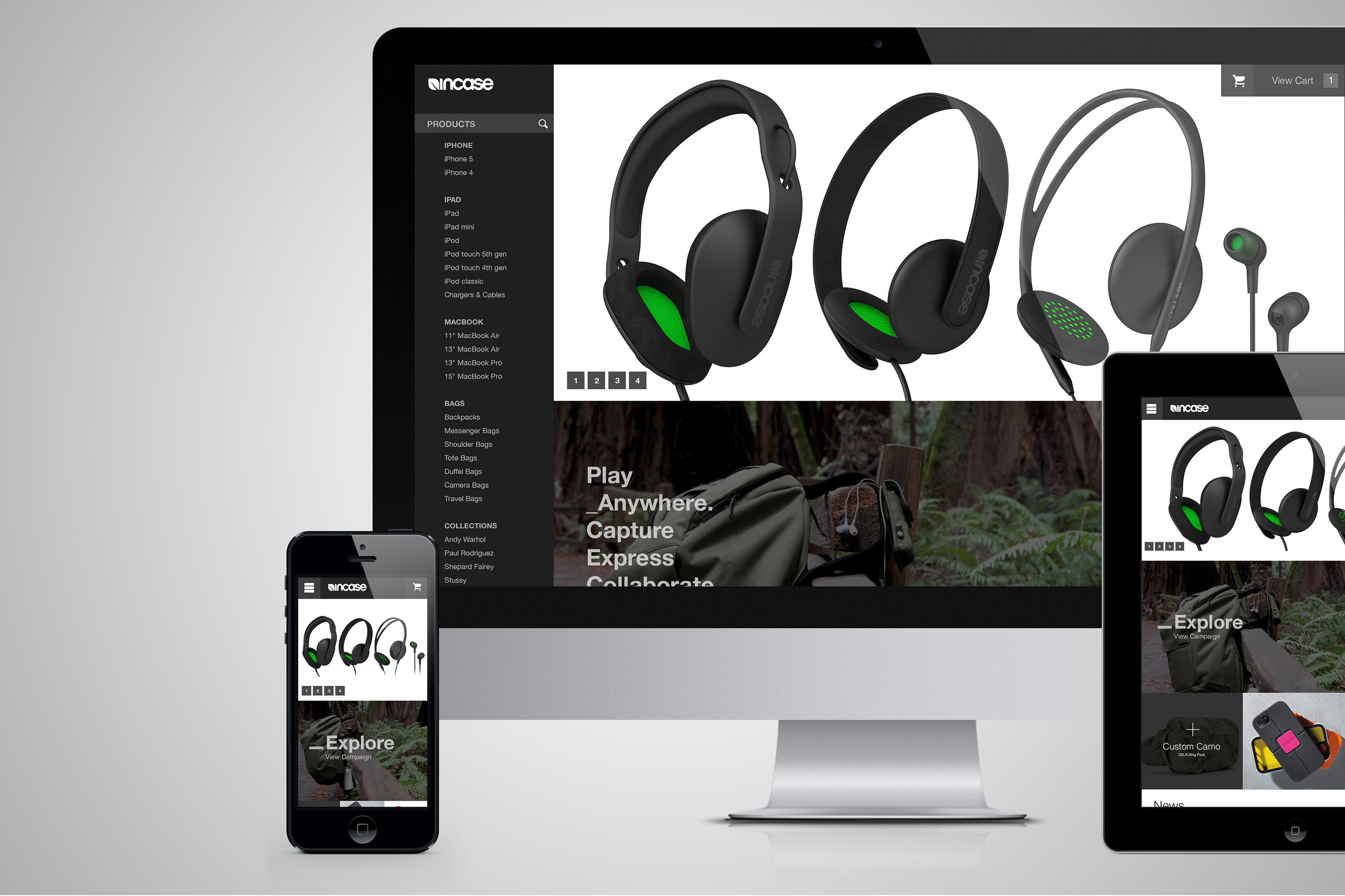
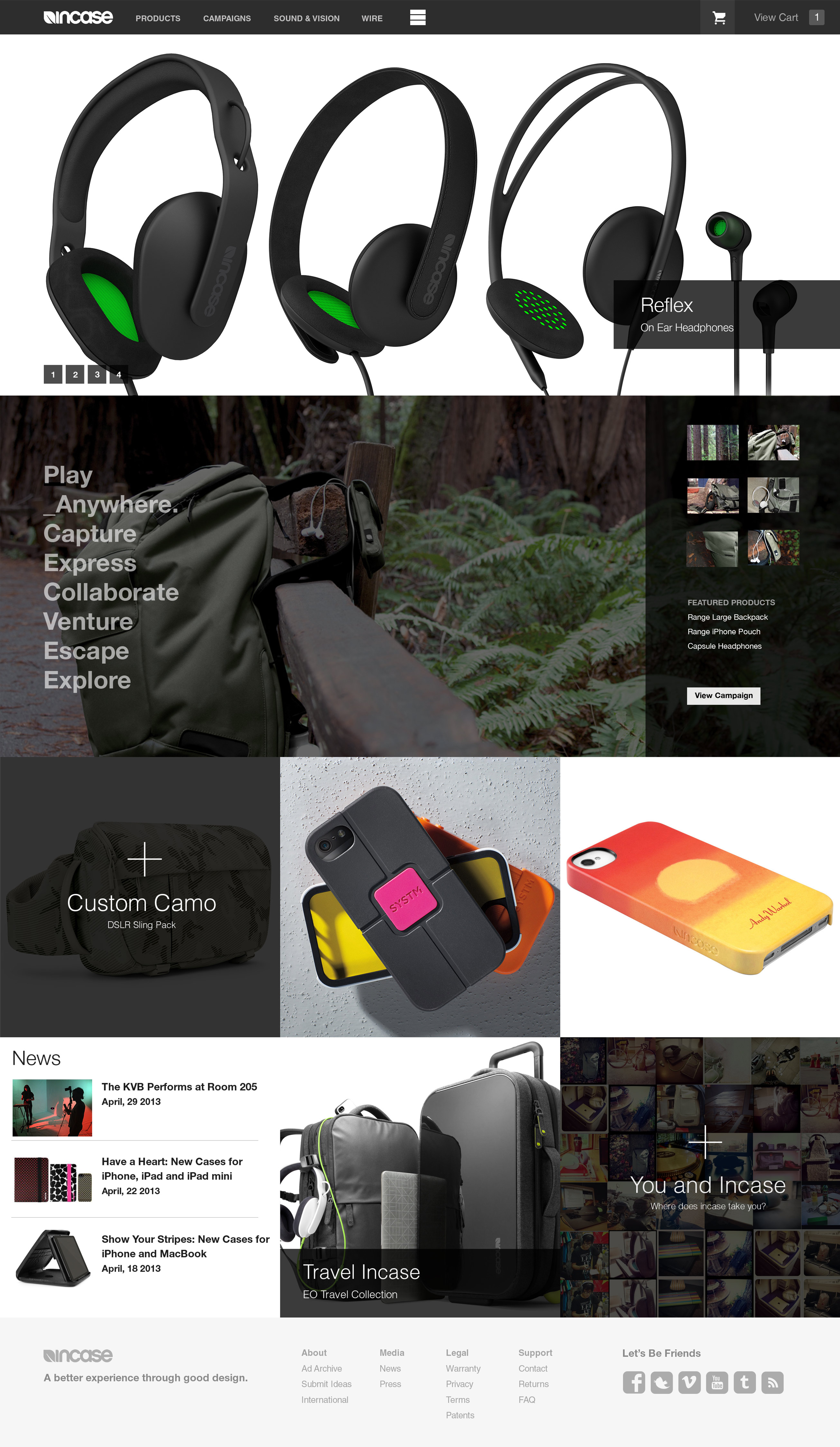
This responsive visual design was handcrafted by Zumeo Design for the Incase creative team in SF/LA. The design starts and ends with an homage concept. In order to showcase multiple products in a simple way, we created a Parallax scrolling system with new products at the forefront. The two product rows would scroll faster than the campaign, and in turn, the campaign would collapse with the scroll. This insures that product is the focus while introducing the user to new aspects of the Incase brand: news, social media such as Instagram, campaigns, etc. This project covers Incase's main homepage, campaigns upgrade, product showcase, and two extensive navigational options.
Home Top Navigation & Cart
Navigation on the Incase website presented the biggest area for improvement. Although there was a need to simplify and consolidate, we chose to stay with the current structure. For this version, we spanned the navigation the entire width of the browser to utilize the horizontal space to visually simplify the navigation links. This 100% width approach was also applied to the cart. This concept insures a seamless transition to tablet and mobile.
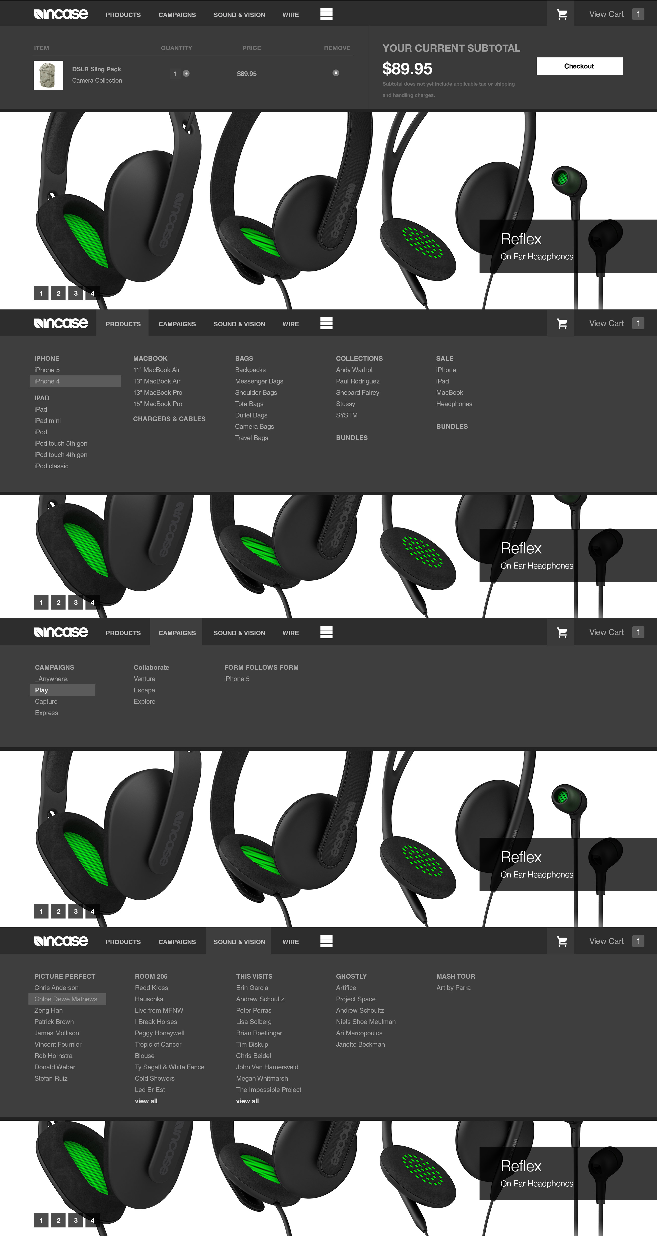
Side Navigation Option
Navigation on the Incase website presented the biggest area for improvement. In this second option, we created a side navigation that remains constant on desktop but uses a hide feature on mobile and tablet. All main menu items are collapsible.

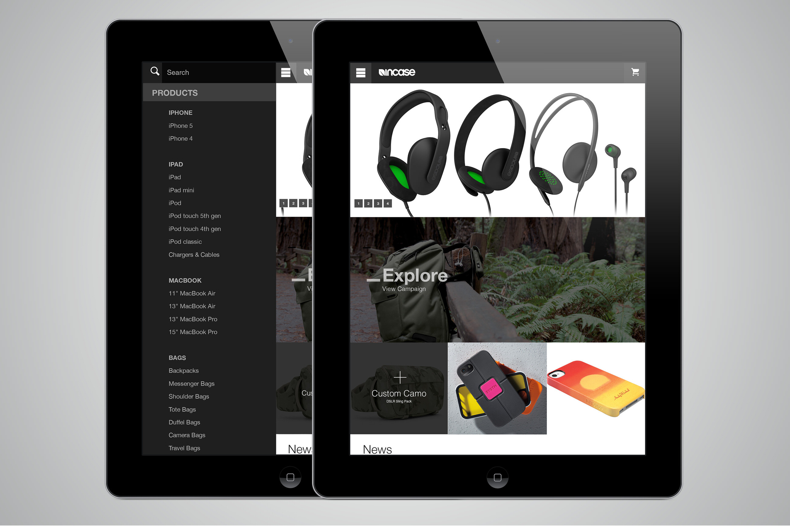
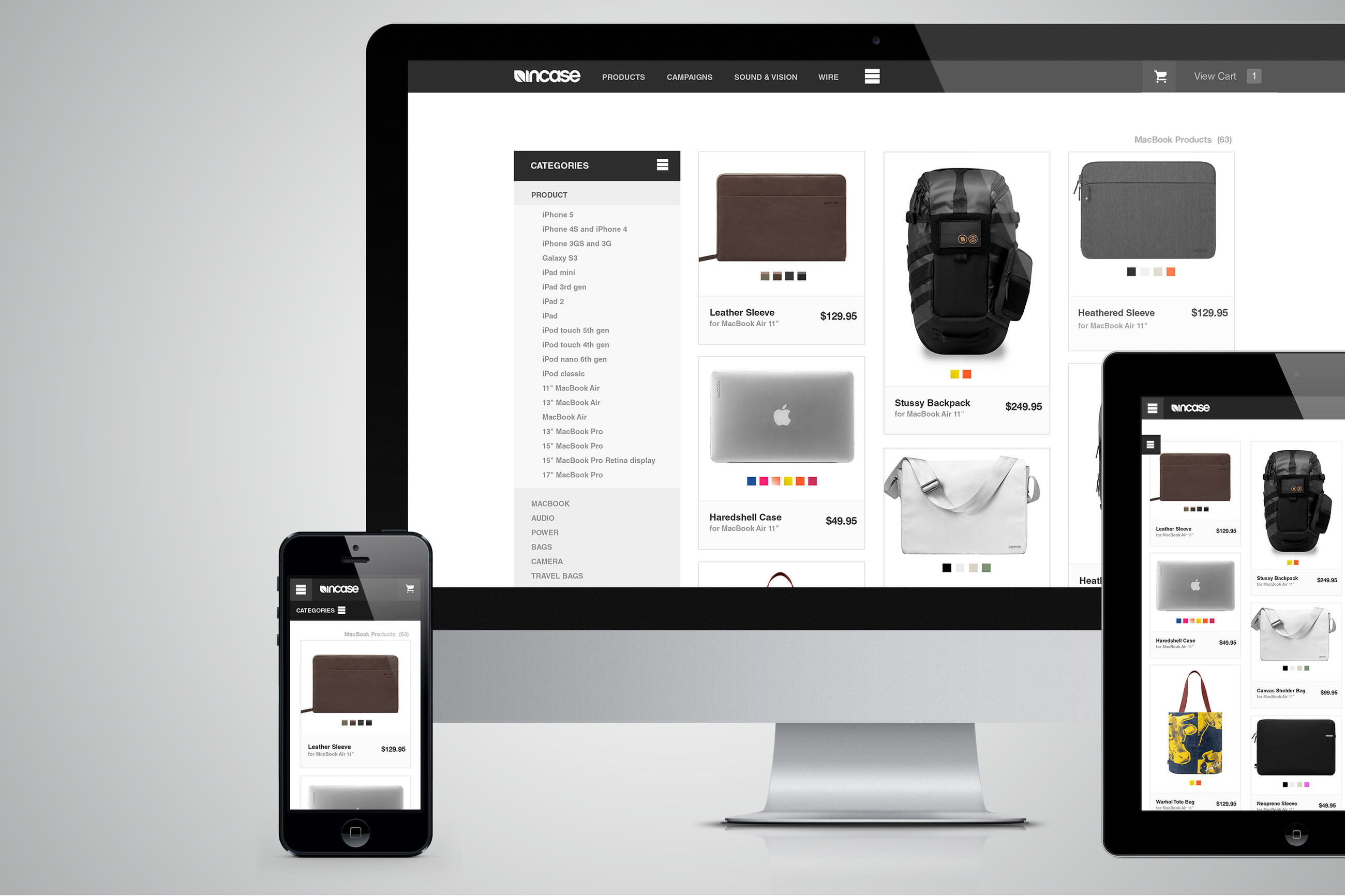
Tablet
Navigating the Incase website on a tablet is currently very difficult and can be considered virtually impossible on mobile. For both the mobile and tablet navigation, we chose a slide-out side menu. This allows the user to easily view the main content while always having access to the needed links. The side menu would scroll, and search results would show as list items below the search box.
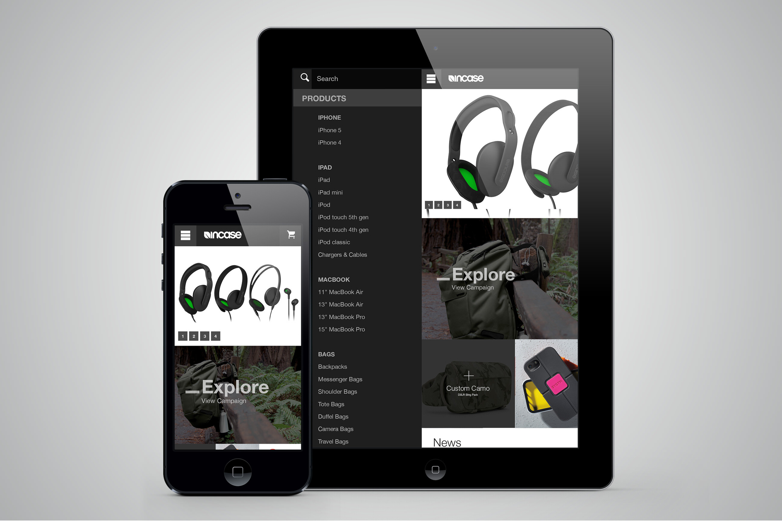
Tablet Content Reflow
In order to adapt to tablet, we used a single column for news and reflowed the other two showcase boxes below. It is also worth mentioning that all sliders are meant to seamlessly work with native tablet gestures such as swipe and tap.
Mobile Home Side Navigation
The mobile design approach is centered around touch navigation. Phone 1 shows the campaign slider in mid-swipe, Phone 2 shows the navigation open, and Phone 3 shows the cart open at full width.

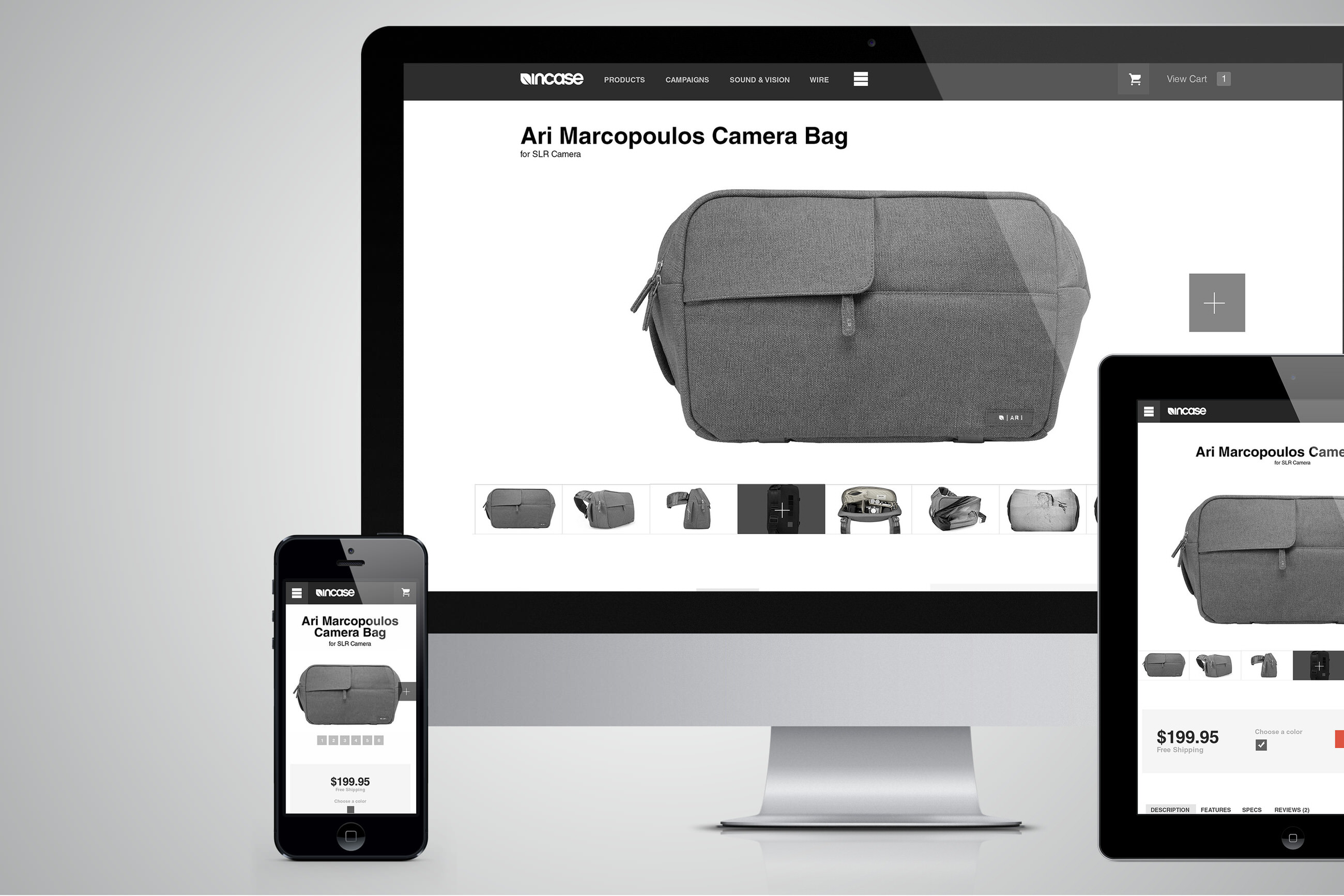
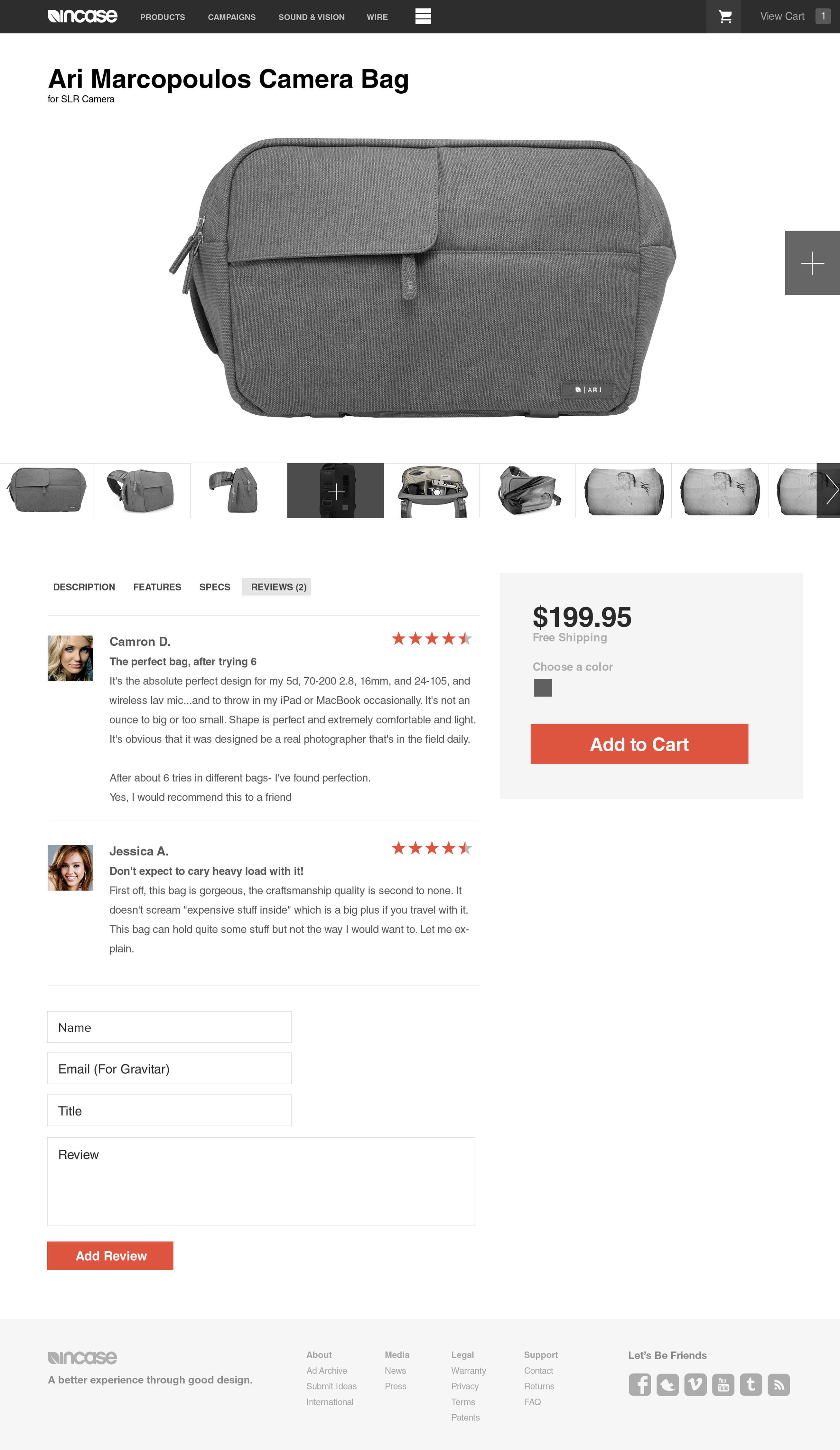
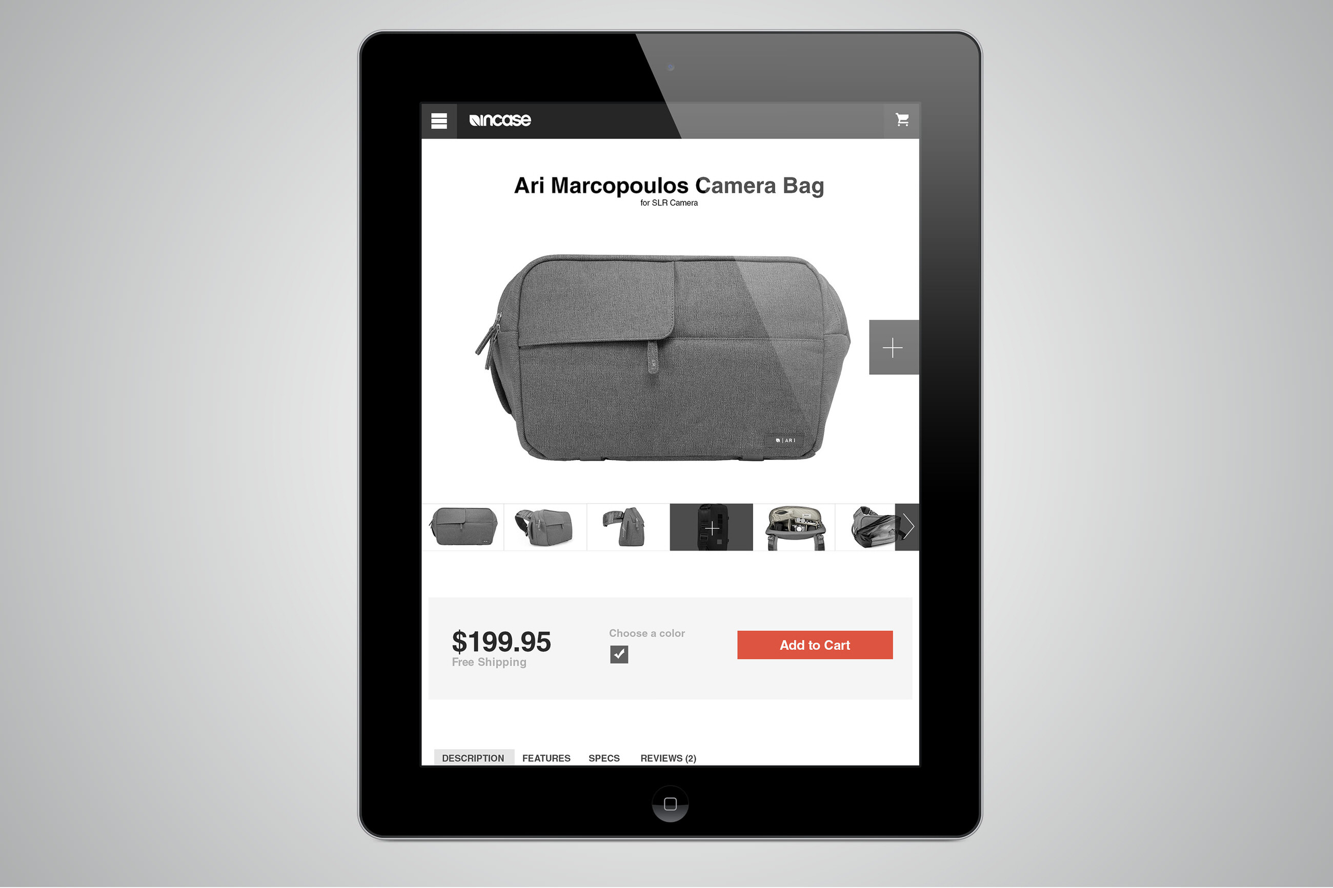
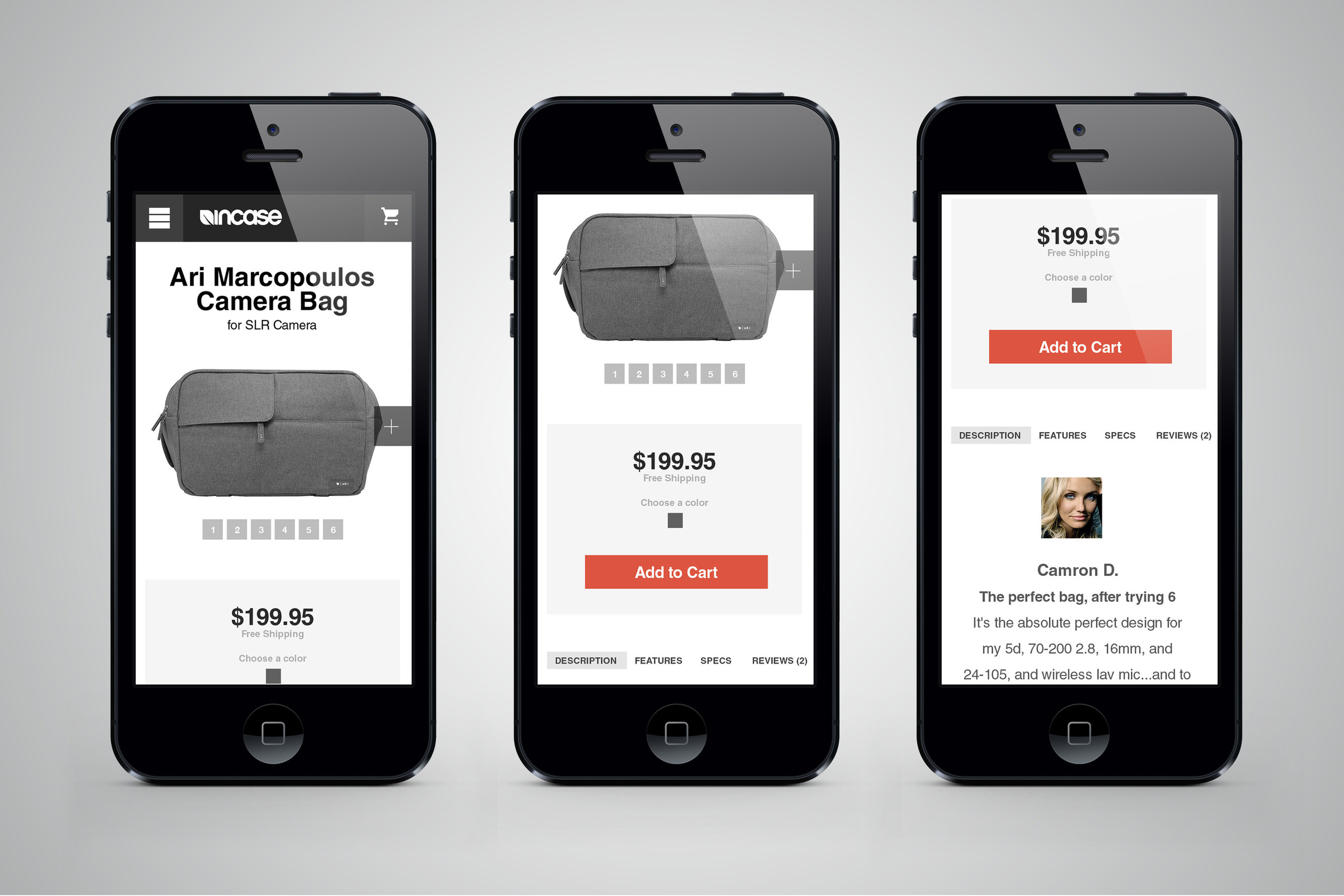
Product
Introducing the new Incase product page. One of our first goals was to increase the size of the product images. By placing them in a slider, it eliminates the need to click on the individual thumbnails. However, in order to quickly compare products, we have created a thumbnail row as an option. The related products section below makes the user aware of other similar products in a given product set. Posing as a shopper, we found this task difficult initially. With regards to reviews, we believe this is one of the most important concepts within a retail site. Using Gravatars is a simple and easy way to populate pictures.
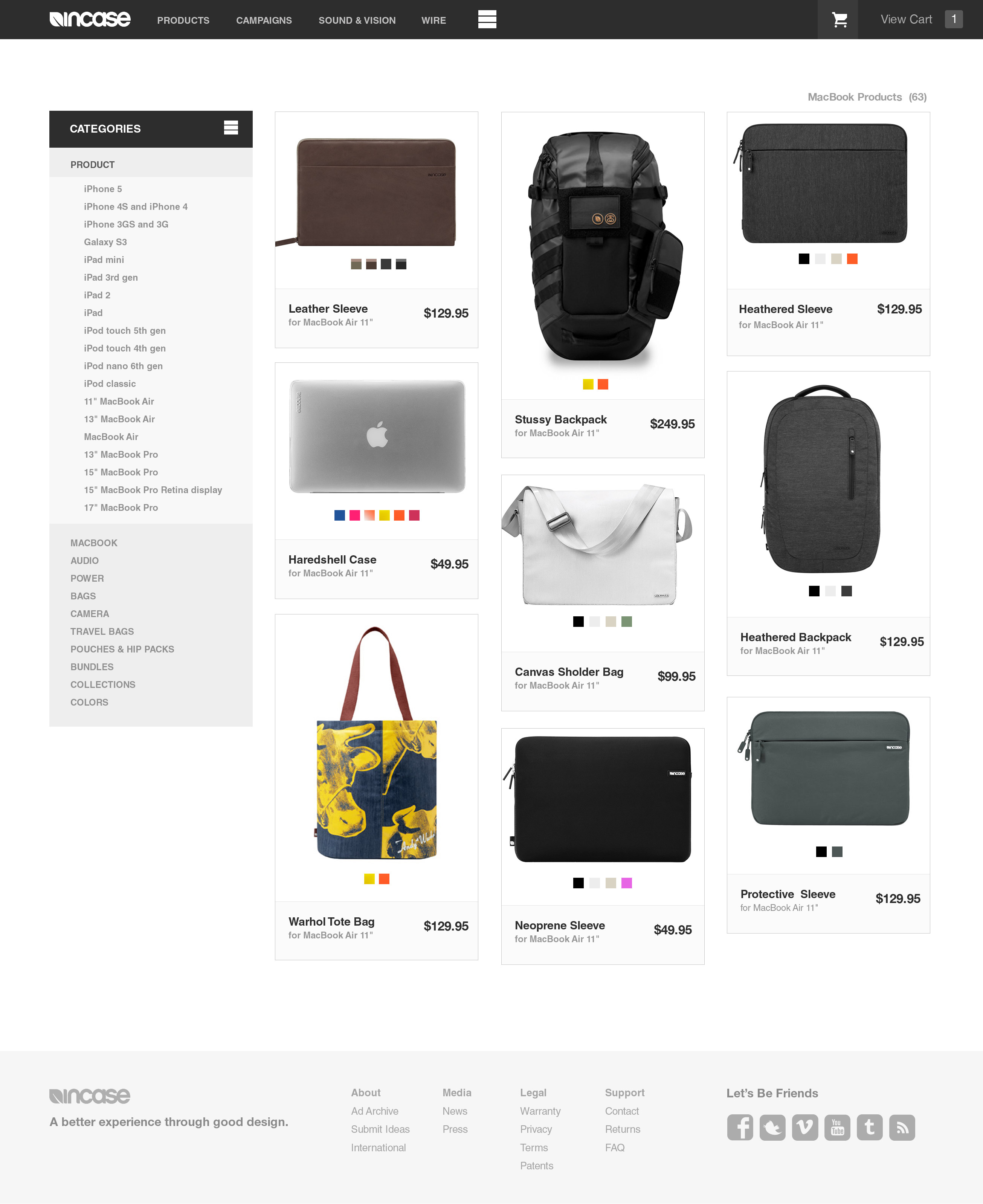
Showcase
The new showcase page is based on a technique called Masonry. This creates a grid restricting image width but not height. The traditional grid forces taller items to show much smaller than the other products. Masonry is important because it shows the Incase products in their native proportions. The side menu is also collapsible, keeping it concise and easy to navigate.

Showcase Mobile
For mobile we convert to a top-down sub-navigation. This collapsible method allows the viewer to quickly access the product categories without interfering with the main navigation.

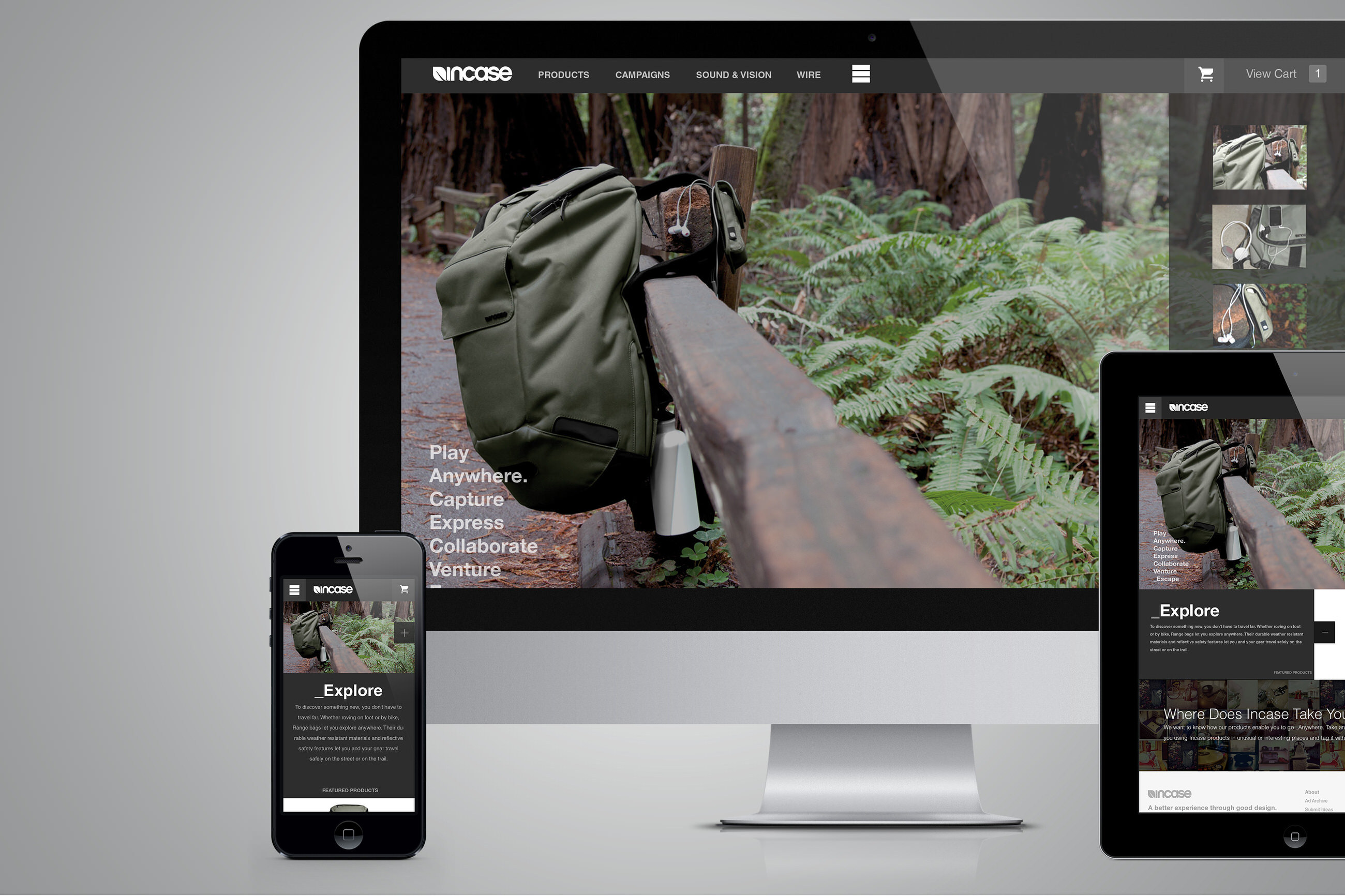
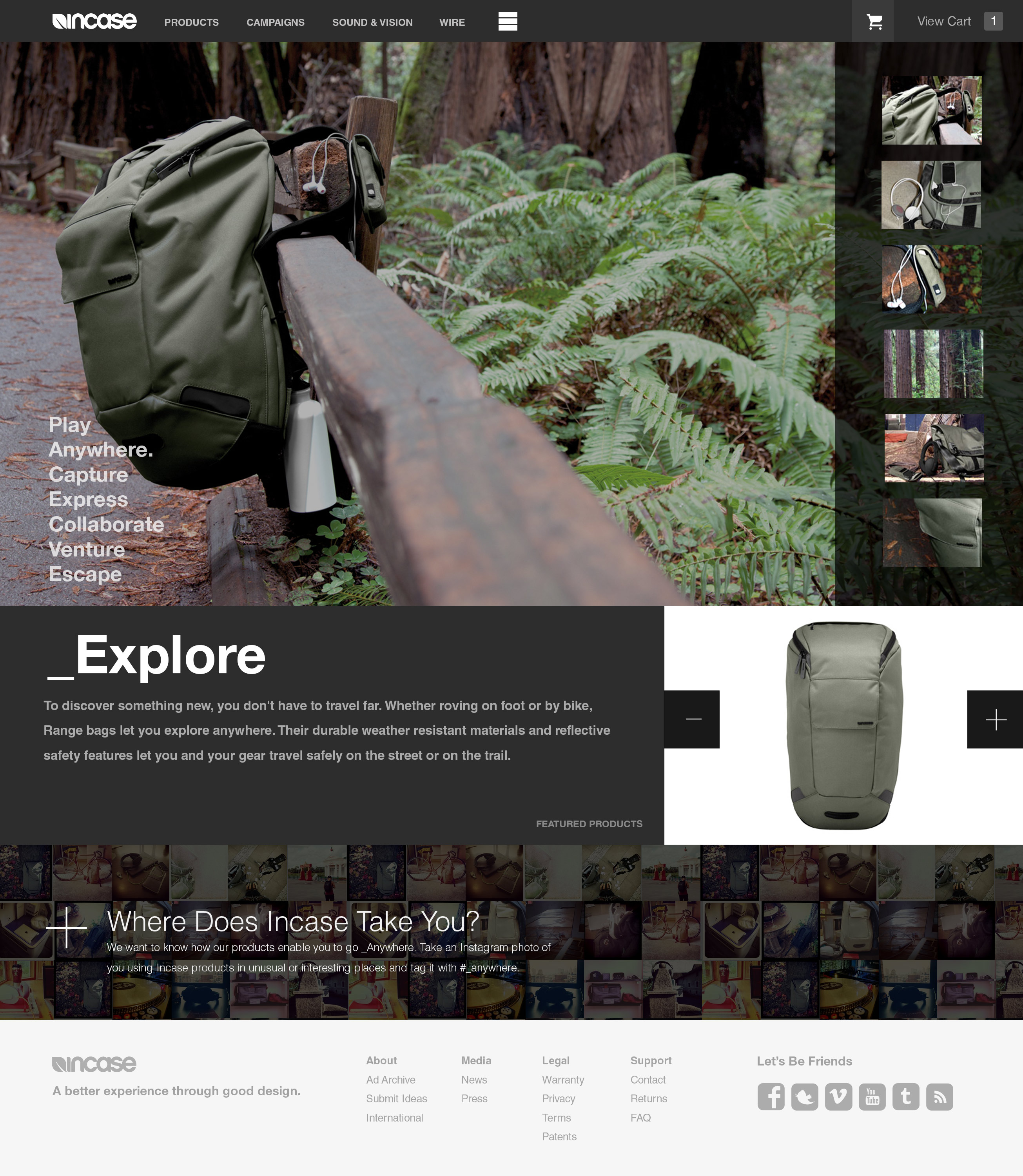
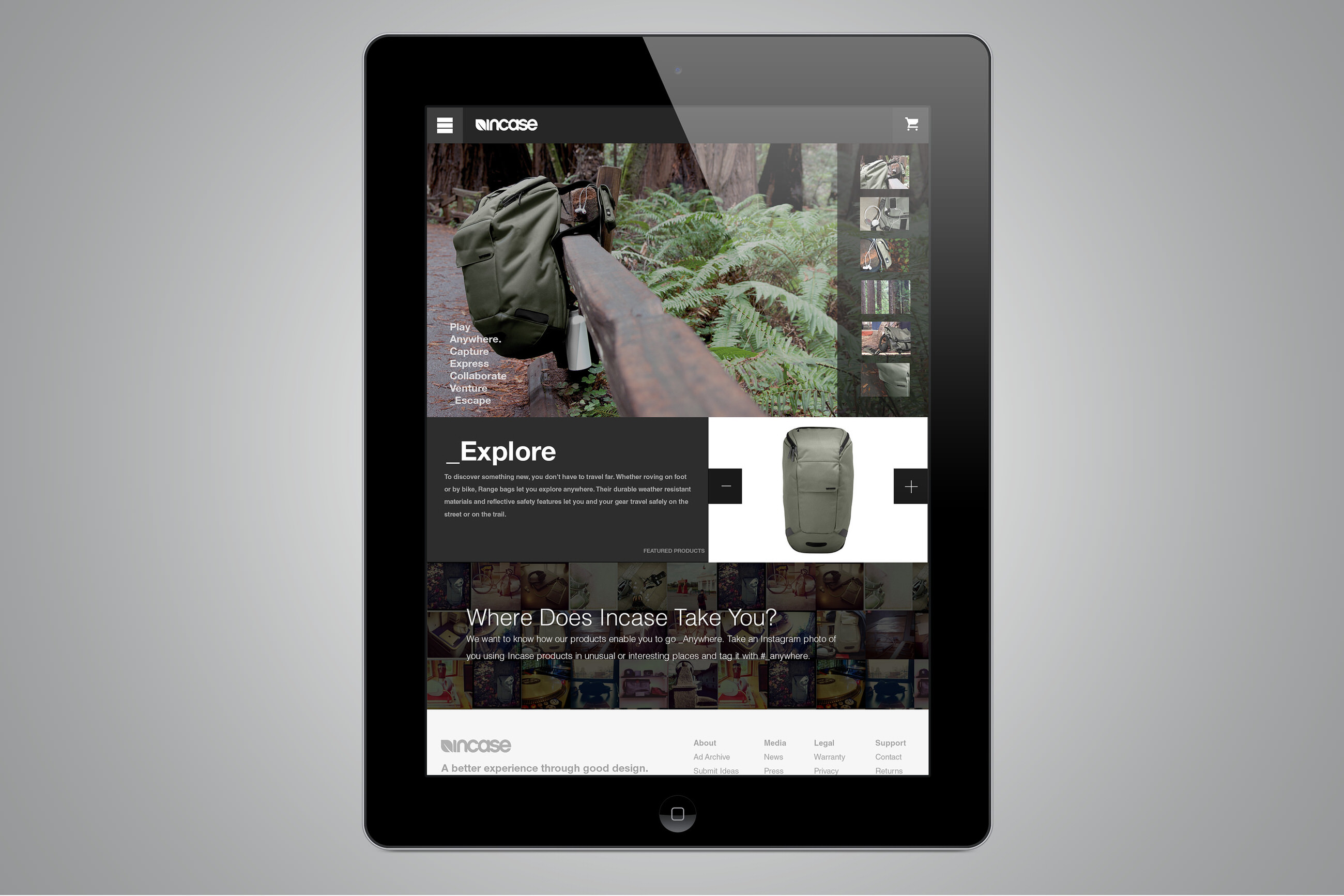
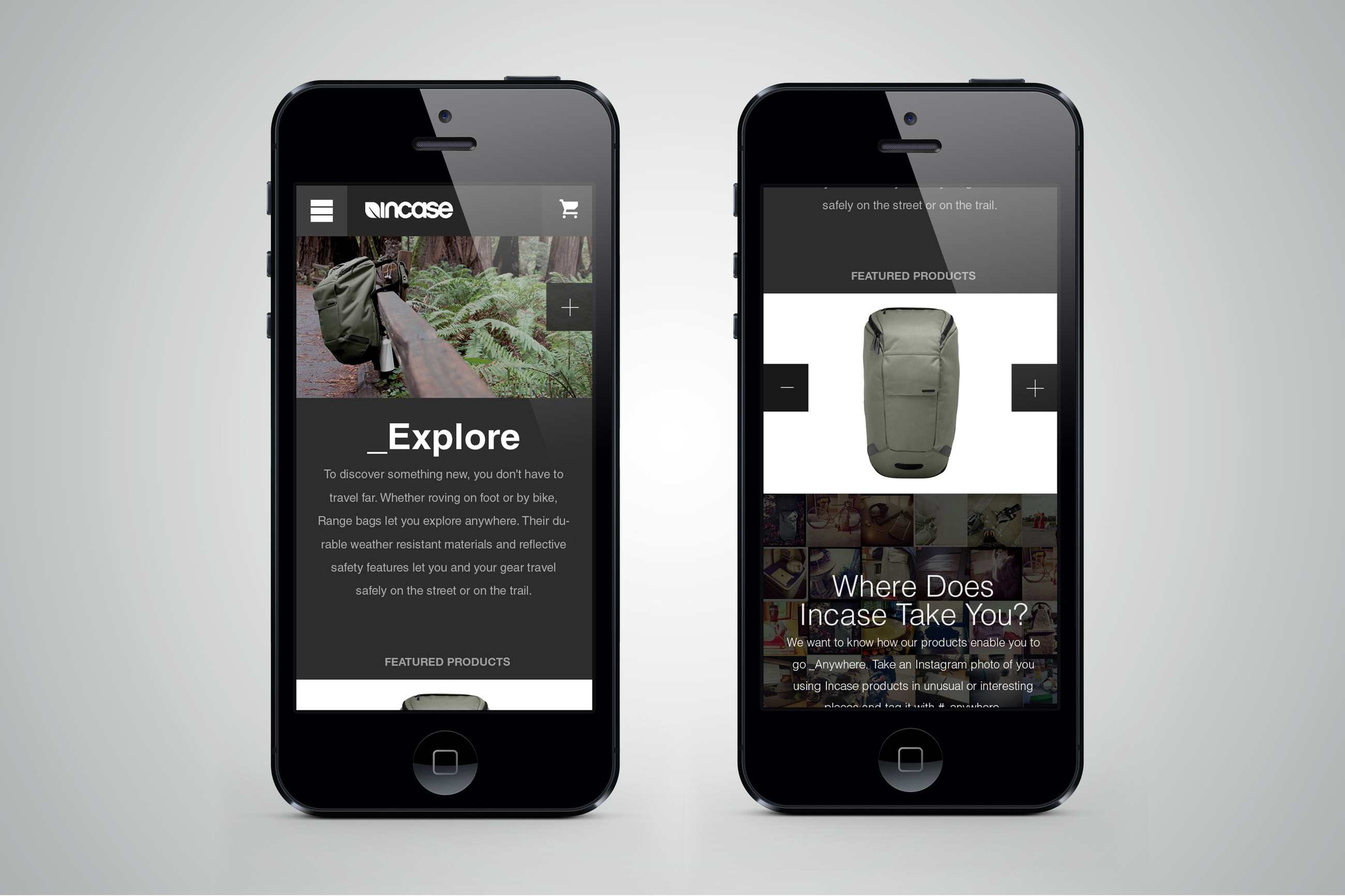
Campaign
The main purpose of the campaign page is to create an experience around a product or set of products. It is important to make the products in the campaign easily accessible to the user to review and purchase. In light of this, we created a responsive slide show at the top and a smaller slider highlighting the product directly below. This allows the viewer to quickly scan all the products used within the campaign.